First test phase of the TMaaS traffic dashboard a the Gentse Feesten

In-depth testing by traffic managers
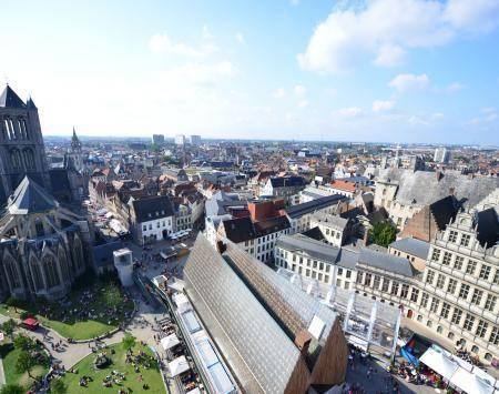
Every day of the Gentse Feesten, a traffic manager from the Mobility Company of the City of Ghent was present at the command post together with the fire brigade, the police and the emergency services. After all, around a million people visit Ghent over the ten days of the festival and that presents a multitude of organisational challenges. It was the ideal occasion therefore to carry out extensive tests of the first prototype of the TMaaS dashboard in its current form. Moreover, the City of Ghent invited all TMaaS partners to spend an evening in the control room and gain first-hand experience of how things work on the ground.
The dashboard testing continued throughout the duration of the Gentse Feesten. The traffic managers observed the data and checked on whether they were being alerted to situations such as accidents, etc. Monitoring accidents is after all, a very important task for traffic managers. In addition, they actively tested the various functions to remove any bugs. The tests were extremely practical: was there anything that appeared on maps that they were unable to explain? Are there elements that do not link to the correct data?
An enormous amount of data was visualised in the prototype of the dashboard:
• data from TMaaS project partners TomTom, BE-Mobile and Waze (City of Ghent is a participant in the Waze “Connected Citizens Programme”) about traffic incidents and traffic density. This information is used, for example, to show the location of accidents on the map, together with the current traffic speed on certain roads or delays on the main traffic axes;
• data from underground car parks (the number of parked cars in Ghent and the evolution of parking density over the last 24 hours) and the bicycle park facility at the Korenmarkt;
• data from the Blue-bike (De Lijn) bicycle sharing points and the Trapido Ghent bicycle sharing Based on these data, traffic operators can see how many people are leaving Dampoort Station among others.
All these data are displayed on a dynamic map with colours. This indicates immediately to the operators which car parks were busy and where action needed to be taken. This might involve guiding cars to a park & ride via the notice boards, or by advising people to use public transport via Twitter. A page with graphs and indicators could then display any changes or the current status of the total number of cars in the car parks for instance.
More personalisation and interactivity
The experiences of the traffic managers are already positive, even though the dashboard in its current phase is not ready for traffic management operations. One important observation concerns the map visualizations that were not entirely clear. The choices of colours to represent different incidents did not really indicate which situations were critical, and some incorrect data came up.
And finally it seems that too much information was provided, which made the map over-busy and cluttered. The real problems were not immediately obvious therefore.
The traffic managers also asked for more personalisation and interactivity. In the prototype the Grafana graphs and maps were reproduced on a static webpage. It was not yet possible to enlarge the graphs or move the widgets to create one’s own page with relevant information. That will be remedied for the next version of the dashboard.
Also tested by residents
The test resulted in 75 suggestions on which the TMaaS software development team, consisting of employees of different project partners, is now working to further optimise the dashboard. This step-by-step approach is characteristic of research projects.
In a few months, when the Winter festival in Ghent will attract thousands of visitors to the city, a new test will be carried out, in which Ghentians will also participate. However, the general public will have to be patient for a while longer as the official launch is planned for the spring of 2020.


